On the previous post you can see how the Logo Development has began to move on... and how the tone of voice has began to change with the style of typography which is based on hand writing of a signature. The underlay of the logo gives the image a completly different tone which is visually appealing
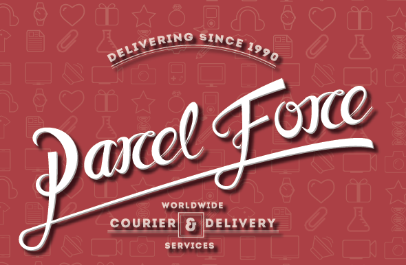


You can also now begin to see the development of the brand identity. The use of Intro the typeface adds an official feel to the brand.. which is important as despite the reinterpretation of the band the legitimacy of the service still needs to maintained.. although the typeface used has a more playful feel to the brand identity.. and they typeface defiantly has a tone of voice which is appropriate in this reinterpretation.
The use of colour needs to be addressed.. the colour itself i am not going to change to much as it is currently the strongest par to the identity.. thus will will edit the existing colour.. to create a mor approachable feel.
No comments:
Post a Comment