Showing posts with label brief 5 - Design Bridge.. Show all posts
Showing posts with label brief 5 - Design Bridge.. Show all posts
Tuesday, 28 May 2013

Monday, 27 May 2013
Sunday, 26 May 2013
MOving Image-Parcel Force
More deliverables from the collaboration between myself and patrick.. Here you can see the entire range of packaging..
I think the brief has been a success in the sense that i have achieved a tone of voice that i wanted to in what is considered and very corporate business sector,, which defiantly works as a brand reinterpretation. The image of the brand is eye catching and will have a familiar tone with its consumers, something that other companies with in the sector do not.
Parcelforce fly by h264 from sam edwards on Vimeo.
RANGE
The purpose of the range is simply to push the identity on the consumer public to try and change the perception they have of the brand which will work as a reinterpretation of parcel force.


the stationary of focus on the more corporate side of the business is still client facing, thus needs to still hold a strong identity of the brand..i especially like the icons in light opacity running across the paper etc.. i think this makes the stationary standout from normality and defiantly still embodies the ethos i was trying to portray through the brand.

The van will be seen everywhere due to the success of parcel force.. therefore it needs to be strong visually, like this one above is.. perhaps the logo could also be added however i like the way in which it isn't as it ads a degree of intrest and as the iconography is so recognisable i think this will work as identification to the general public as well as hitting the right tone of voice.

Uniforms of workers are more casual and therefore easily identifiable will give the consumer less of a sense of formality in interaction which will make them feel more relaxed therefore will change the perception of the corporate nature of parcel force.
Promotion.
The promotion for the project is perhaps the most important part in selling the idea to the judges.. and it wil compltly change the tone of voice of the brand.
The Advertising is designed to amuse potential users of Parcel Force. This is done by taking a blunt and simple approach, highlighting the nature of parcel being send, specifically looking at things of a more personal nature that are considered universally awkward or embarrassing. This back up by the simple strap line ‘Delivering things, so you don’t have to’ which highlights the service Parcel Force provides; adds a personal touch to the consumer and will help to create an affiliation with the brand. The brand identity also runs strongly through the advertising, which will increase brand familiarity.


Web//App
I wanted the web design to follow the consumer friendly feel that the rest of the brand is developing, therefore the web need to be user friendly and easy to use. The focus needed to be giving the consumer the information and the them finding it easy to act upon it.. there fore i designed a simple grid system for the layout.. with a consistancy in the colour etc to the bran identity as well as the intro typeface.


Abouve you can see the gird system used for the web design .. its simple and designed to portray information effectively as well as being easy to follow. with very specfic tool bar options. the icons again work well as a back drop with a 20% opactiy.

Login details..
The typeface used through out the identity really pushes the desired tone of voice.. that of formality but still a relatively fun approachable brand. The brand colour works well against the nutral grey background.

The use of helvetica for body makes the legability improve through out the digital delverables.

Example of the tool bar.. the use of drop shadow makes this stand out. against the other parts of the grid.. which means the eye is straight drawn to it.

Logo over the top of an image gives the sense of an approachable brand quite unlike any other of the competitors.

simple typographic promotions.. following the same layout as the logo to increase awareness or familiarity.


Lower opactity icons.. lets the logo stand out more against the red identity.. this would be a start up screen.


Looking at app development.. specifically a parcel tracker.. which will give the consumer a feeling that his requirements is important again moving away from the normality of the business sector.. the design again is very simple and enables easy movability around the app. following the same colour schemes as the website.. creates a connection between the to.
Tape..
I have also considered the fragile tape.. again following the same design but inverted as the brand so far.. which pushes the identity further.. and is worth considering for the entire brand image.


Packaging Range.
The main focus in altering the perception of Parcelforce will be changing the image of the client facing deliverables.. there fore the packaging needs to be high impact and interesting visually.. i will develop the brand image already in existence.. icons logo and colour and create eye catching packaging that will have impact.. with a friendly non corporate tone of voice.
For the packaging i collaborated with a moving image designer.. We sat in the AV room for two days.. to get the final image right.. I will predominately dictating the design process although he attempted to teach me the process. I wanted to create a large range of boxes for the final resolution as this would sell the idea more when submitting it to the comp.
The final resolutions looked as so.


The final resolutions i am happy with, i think it encapsulates tone of voice i was looking for through the reinterpretation. You can also begin to see how the icons change the tone of voice of the brand and it completely moves away from the corporate stereotype of sector. The logo stands out nicely against the new tone of red that highlights the playfulness of the brand. As a range there is a good amont and i think his will work well for the submission for the comp brief. The collaboration worked well also and i will consider using the cinema 4d in the future for packaing mock ups due to the efficiency as well as the the final resolution looking superia than to a badly crafted net.
Iconography .
After finalising the logo.. i began to think ho wi could make the identity more identifiable and playful which matches the mission statement i set myself. Therefore i decided to develop a range o icons that sit as part of the idenity to strenghten it.. along with the colour streght and logo.. The iconography is based on things that individuals will send using parcel force the brand.. this will help the consumer to relate withe brand more. Also moving away from the corporate feel.. i think the icons will mak the brand identity stronger.. and wil work well with the packaging etc..
examples below


above you can see the iconography developed for the progression of the identity this will be applied through out the range of deliverables as i think the tone of voice it portrays is more approachable which is the vibe i am going for.. with a reduction of opacity it could work below the logo.. across packaging etc. I explored different colour variations as i am not sure yet which direction the entire range of packaging will develop in.
Colour Swatch
The chosen main colour for the brand needs to be high impact.. and to push forward the new image of parcelforce.
The chosen colour gives a more hard hitting but friendly approachable feel.

Logo Development continued.
On the previous post you can see how the Logo Development has began to move on... and how the tone of voice has began to change with the style of typography which is based on hand writing of a signature. The underlay of the logo gives the image a completly different tone which is visually appealing
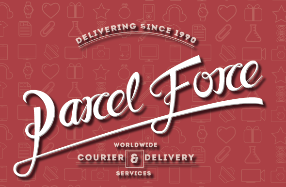


You can also now begin to see the development of the brand identity. The use of Intro the typeface adds an official feel to the brand.. which is important as despite the reinterpretation of the band the legitimacy of the service still needs to maintained.. although the typeface used has a more playful feel to the brand identity.. and they typeface defiantly has a tone of voice which is appropriate in this reinterpretation.
The use of colour needs to be addressed.. the colour itself i am not going to change to much as it is currently the strongest par to the identity.. thus will will edit the existing colour.. to create a mor approachable feel.
Vectoring The iogo.


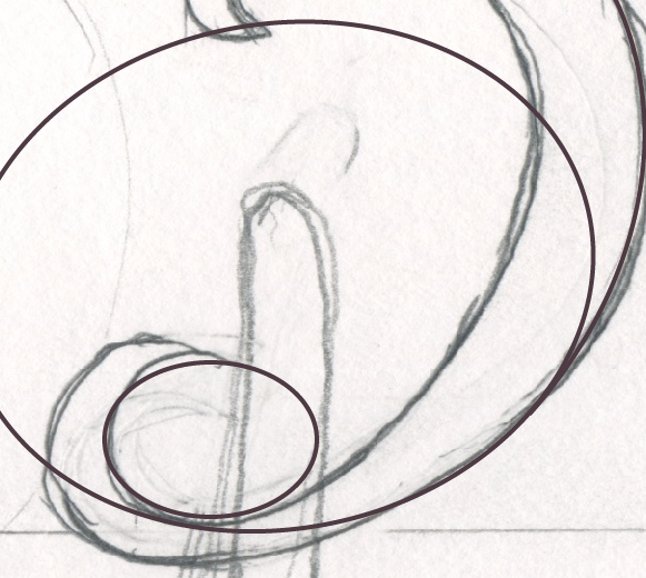
Here you can see the process of drawing the logo. The style i went for is a hand rendered style based on the signature one would sign us for a parcel force.. this would give a more approachable tone of voice to the brand a whole due to the movement away from the stereotypical corporate style of the sector.
Subscribe to:
Posts (Atom)