Showing posts with label Brief 3-Fine Art. Show all posts
Showing posts with label Brief 3-Fine Art. Show all posts
Tuesday, 28 May 2013

Saturday, 18 May 2013
FInal Spreads Year Book
Below is the final pdf for the fine art spreads.
The overall all aim of the publication was to produce a piece of work that best represented and gave a sense of legitimacy and identity to those on the course.. i think that this has been achieved. The grid system has allowed enough freedom to make every page different whilst still keeping a constant identity which is interesting to look at.. therefore i think the publication itself has been a success. The design process being allocated tasks with in the group work well also.
Fine Art print Proof
Below shows the print proof received back.. The paper stock was that of the real publication and both gsm worked well.. with the slight coating really bringing out the quality of the images.. there was again one or two that were changed.. however the final outcome was approved and thus is now in production.


Not debossed for the proof.


The quality of print really bought out the vibrance in the images as well as highlighting the duo opacity used with in the body.
Final Proof
Having done the front cover and amendments we got it put together in preparation for a print proof.. and got it checked one more time by the fine art team and the university proofer. With very very alterations bar the odd image rotation and addressing the order of names for the fine art staff. we were ready to send it to print.


Final Front Cover
The final front cover was chosen as option three.. i think the blind de-boss on the font cover will add another dimension to the publication.. that of feel.. the way the de-bossing will be blind will be an interesting effect, as will not interfere with the image to much. The magenta trim also encapsulates the internal constant of the book.. which will make an impression due to it vibrance.
Fine Art Year Book-Cover
As explained earlier on the blog, one of the resounding themes of the fine art year book is to give the individual a sense of identity, both with in the publication and with in the art world. Therefore the concept for the front cover is derived from this.
We asked all the members of the fine art course to bring in something that was either representative of them as a person or practitioner.. with the general aim of have a collection of things that embodied the individuals on the course giving them a sense of identity on the front cover.
The photo was arranged in a structural manner to produce an interesting ascetic. The image we as individuals had to work with is shown below.

Here you can see the resulting image.. which gives us a good basis for the front cover due to the structured but interesting image created.. with strong conceptual basis. We then all began to play with the image ourselves. To come up with interesting visuals.
From a personal perspective i was did not want to alter the image greatly as i think the structured nature of the layout was already a strong visual.. it was a decision on how the title would be printed/embossed etc.. as the rest of the layout..i.e the spine is dictated in the brief requirements.
Myself chloe and Ben then put our spreads together in a brief pdf and sent it to the fine art tutors in pdf format.. the pdf with explanations included or also on there.
FIrst Proof.
Having a complete the first complete publication... we put it together for the amendments.. and gave it to fine art.. as discussed earlier.. the words were removed from the side of the images on the spreads.. to create clarity within the artist ethos behind the work.. which resulted in my opinion as a cleaner overall appearance. The portraits on some of the publication were also upside down.. which was subsequently edited as well. There were image amendments to some of the spreads.. but the overall consensus was that of a positive one.

Wednesday, 15 May 2013
Personal Alternative Spreads
The 'alternative spreads' are the name we have given for spreads that are not the individuals work or double page spreads. The alternative spreads include:
Welcome Page
Garry Barker essay- Burden of Proof
List of Exhibitors
Contents page
Precious
Dilate
Scottish Sculpture Workshop
Thanks
Proof.
We were then split into teams with in the group again to work on the spreads.. The allocation saw me work on:
Garry Barker-The Burden Of Proof
List of Exhibitors
Precious
Scottish Sculpture
Garry Barker Essay-Burden Of truth.
I began the design of the Double page spread by keeping to the same basic layout as the individual spreads, this was done to keep design consistency through the layout.. The purpose of these pages unlike that of the dps was to create the body text as the focal point but still making it visually interesting for people interacting with the publication.
I would like also to keep the same rules applied to the spreads.. as this will enable a complete design consistency:

Showing keeping the same layout rules.
The typeface used through out is still staying consistent through out the publication.. the body text will be a perpetua 70% tint.. where as the Headers still Helvetica Neue. Bold and Reg. again to keep consistency.

The type has been be added first..as this is the purpose of the double page spreads.. therefore must be considered first. The essay itself is is a fairly substantial in length. Working across two column is breaking the rules set by the previous spreads.. however it is more appropriate in the case due to the readability.. However when there is less text on other spreads i will aim to refert back to three collums.

Adjusting the text to compare aligned from top or bottom..?

Although the focus is on the type.. the type it will be nice to include images on the page. I think it is important the images dont detract from type.. there will they will be relatively abstract in nature... we got the fine art team to take some studio shot for us. The images used should give the spread a certain movement to the eye.

Adding the images.. gives the spread a certain movement.. which is the desired outcome. I have kept the same rules.. across the images.. using the set of three. The images themselves are relatively abstract in nature.. to cause an intrest.

Shows how i used the grid system to dictate the layout.

This layout works well.. the image aligned could be adjusted slightly.. the name of the writer follows the same rules as that of the headers.. to keep consistency.

This show the arrangement of photos edited.. the alignment of images has improved.. as well as the type being set from the bottom which keeps a more constant visual image.
The final Gary Barker Essay.
This is the final Layout.. some of the images have been changed.. due the poor dpi of them. As awell as the edition of the job title etc.. which was done on request, however still following the same rules dictated by the titles of the personal dps.

Alternative options for Gary Barker.

Using a full bleed image would crete something more visually interesting however it would detract from the over all message of the page.. which is that of the type which is why this idea was not used.
Welcome Page.
The welcome page sets a set of new challenges being as it a single page, i will design to the same set of rules that runs through out the book, a start of three collum same bleed and same margin width. The use of images, will have to be more considered due to less space being available and not wanting to detract from the body text. The header text etc will again follow the same rules.

i will begin the design of page by placing the text as this is the focal point of the page. I have used the central column to push the hierarchy of the page.

The introduction of images, will follow the same rule as the previous page, that of creating intrigue through the abstract nature of the images.. i will again revert back to using two images however as the page will become over cluttered and white space will be lost. The magenta highlighting the title and the page numbers will also work well on the page..as a consistant... the shock of colour always allow something eye catching.

Final welcome page.
Simple design effective communication.

List of exhibitors.
The List of exhibitors acts as the map of the book.. and therefore perhaps the most focus has to be spent on creating clarity with in the double page spread...

Agin consistent page set up..I will focus on the body text first.. i want to create a certain degree of movement... across the page, although this is a dry page, it can be made typographically interesting. SPlitting the list up into sections will do this.
I am going to break the rules slightly and right align the text...this is different to the majority of the book, however it will cause intrest.. and also.. work better with how the name lines up with the relavent page numbers.

Using the same type rules on font and point size.. the surname being highlighted also adds another eye catching dimension... and the tonal quality of perpetua also helps to highlight the name.

The second set of text added you can already see how movement is being created within the page, which will make for visually intresting outcome.

You can also see by arranging the text like this it naturally begins to leave space for the images to fit, which again will help improve the visual quality of the page. I am going to work on a set of three basis.. on the each page, as this follows the rules set at the beginning.

Hear you can see how the image fits perfectly into the type layout. which is ideal.
Starting the second page, will follow a very similar layout... What has to be important for the success of the page is the hierarchy of text.. and how the reader reads it.. going in numerical order through the lists.. should go from top to bottom on each page.


Now i have and understanding as how the layout will work due to the previous half of the spread.. i can add images to create space.. as i dont want a complete emulation of the previous page.

Again following similar format.
Final Layout.

Although this is avery different style of page in comparison to the rest of the book.. i have managed to keep to the rules set most effectively with sets of three in both image and text.. the final resolution is perhaps my favourite so far, due to the clarity of message as well as making a normally mundane page visually interesting. The images fit well with in the spread with out being over powering.
Precious.
The precious pages again sets a new challenge... that of being an introduction to the collective as well as following an interview format.. like that of the last page.. i want to therefore to create some form of movement on the page.. this will enable me to give the impression of a conversation.

Starting the introduction from the right margin allows to automatically break a convention.. and create a form movement when the conversation is started. also will potentially leave room for a image from the left.
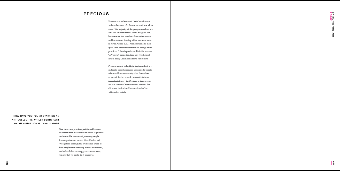
you can begin to see how the movement created will give the feel of a conversation.. it is still very important the readability is not sacrificed. In portant to consider the hierarchy.

Due to the eye travelling form left to right.. the next question starts top left aligned.. this will hopefully create the desired order in which things should be read.

The addition of the first image helped dictate the next placement from text.. the image coming from the spine will adds something visually interesting. the layout of the body text is becoming visually interesting.. whilst still keeping to the rules dictated by the year book.
Final Layout.

At the start of the design of the page i wanted to create a sense movement or conversation.. i think this has been achieved..
SSW.

The SSW i did not have as much to do with, was more helping with the layout once it had been predominately laid out.. We wanted to create a page that kept the set of three images running through it.. as well as keeping it clear and concise with the majority of the text on the right hand page.. this created something visually more interesting than just the straight text.
The next stage in the process is to send take the first draft back.. to fine art and alter the amendments.
Personal Spreads-Draft 2
As a group we had a meeting with the The fine art team and some certain issues were risen, specifically it was decided that the words running along side the images should be removed, this was due to some of them not being a true representation of the individuals work. From a design perspective this could well improve the visual image of the double page spreads.. due to the increased nature of the white space. however conceptually part of the individuality has gone which will have to be represented in an another way..perhaps the front cover?
Lester Drake

Above is the new spread for the fine art year book.. the white space created from the taking away of the words has enabled a cleaner resolution.. as well as this there has been a change of image which combatted the problem of all the images used being to similar.. which has made the page more visually engaging.

The close up of the skull was previously quite abrasive to the eye.. as a result the smaller image is now being used as the complete image. The overall image of the page in my opinion has been improved.. all these will now be sent with a complete copy for proofing to the fine art team.. and amendments will be made accordingly if anything.
Liam Guest


Again here the words have been taken off.. after being in contact with team, the issue with images not being constant was not adressed as it was believed that this was an accurate representation of the work produced by liam. Other issues raised was the upside down images.. these on all spreads have been replaced by images the right way up.
Alex Dunn


Again the images rotated and the words removed from the spreads leaves a freshness to the page.. which works better as a final resolution in my opinion. the opacity reduction of the type through out also helps to ad to the focal point of the page being the art work.
Sam Harriman


The image layout in this case was not changed as they believed it best represented his work.. as well as it be freshened up with the standard amendments. There still could be an issue in my opinion with the type being to close the right hand image.. this will be discussed in the first full proofing.
Isabel Head.


Little amendments here.. the page looks fresh due to the colour of the images being so similar when this is sent for the full print run with a quality finish i think this will be a strong page with a texture focus.
Jade stephenson


The portraits used for this spread are slightly different from the other due to jade not turning up for the shoot again, so there is slight visual variation. which is less than ideal. The images used for this spread i think are the strongest ones i got allocated in creating the most effective looking spread.. the alignment of the images work well.. in creating white space on the page.
Cat Stroud.


The images havent changed here as cat failed to produce a arge image which would of improved the image of the page.. however the movement created for the eye on this page in improved by matching the similar images on one side of the spread.. as you are then automatically attracted to the right spread..
Rob Tatton


The movement of the portraits have improved the visual image of the page.. i also like the effect this had on the type.. as it created a diagonal line across the page.. there may still be and issue of congestion on the left spread that could be adressed before final run.
Alisa Read.


The only amendment here is based around improving the visual image of the dps through creating more of a contrast in images..which will create more movement for the eye to someone looking at the page.
Subscribe to:
Posts (Atom)