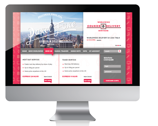
I wanted the web design to follow the consumer friendly feel that the rest of the brand is developing, therefore the web need to be user friendly and easy to use. The focus needed to be giving the consumer the information and the them finding it easy to act upon it.. there fore i designed a simple grid system for the layout.. with a consistancy in the colour etc to the bran identity as well as the intro typeface.
Abouve you can see the gird system used for the web design .. its simple and designed to portray information effectively as well as being easy to follow. with very specfic tool bar options. the icons again work well as a back drop with a 20% opactiy.
Login details..
The typeface used through out the identity really pushes the desired tone of voice.. that of formality but still a relatively fun approachable brand. The brand colour works well against the nutral grey background.
The use of helvetica for body makes the legability improve through out the digital delverables.
Example of the tool bar.. the use of drop shadow makes this stand out. against the other parts of the grid.. which means the eye is straight drawn to it.
Logo over the top of an image gives the sense of an approachable brand quite unlike any other of the competitors.
simple typographic promotions.. following the same layout as the logo to increase awareness or familiarity.
Lower opactity icons.. lets the logo stand out more against the red identity.. this would be a start up screen.
Looking at app development.. specifically a parcel tracker.. which will give the consumer a feeling that his requirements is important again moving away from the normality of the business sector.. the design again is very simple and enables easy movability around the app. following the same colour schemes as the website.. creates a connection between the to.


No comments:
Post a Comment