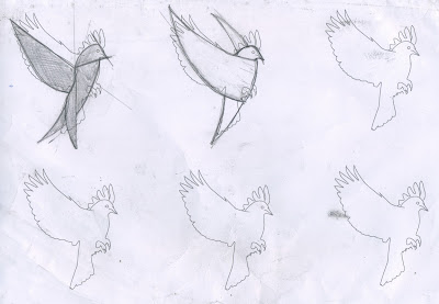
As you can see here i have began to alter the identity of the Vector with the general aim of creating a corporate but recognisable identity.
The most effective logo from the inital sketches i think is the third or 5th.,, its is the vectoring stage that will allow this logo to take shape and begin to move away from the current identity to a corporate symbol. The third however may be a bit to abstract as a result i am going to continue to develop the fifth logo.. keeping in mind the USP of the company and the and the fact that it is the main part of the client facing identity .


No comments:
Post a Comment