The Fine art year has a specific set of rules through out, the format is dictated to us as 210 x 210 which gives certain design restrictions. We wanted to move away from the the mundane feel of last years year book and give more of a personality and identity to the individual and thus to how the course is represented. There are a combination of two concepts that run through out the year book, this is both proof-which is the name of there final exhibition and Aristotle's theory of credibility ethos pathos and logos, which is merely being interpreted as a set of three running through out the publication.


Strong type based publication, gives a very specific tone of voice, which i think is to strong for the year book, however the visual identity of heavy type and high end print process is strong. This is something that could be applied through out the publication on the smaller less significant part of the publication, the impact of the text will allow the attention of the reader to be drawn to the page. The use of the typefaces through out the publication needs to give the right tone, for example a neutral helvetica typeface could work though out as the header text there is a sense of universality. where as the body can be a serif typeface to give a sense of formality. at all time the layout needs to abide to a set of three and this is what we will do when placing the images onto the layout. remembering that the students work should be at the epicenter of the publication.


the detail with in the a publication makes it a success being precise with the typography.. will determine the success of the final visual image. The use of colour in this example will push a message if used in the correct manner.


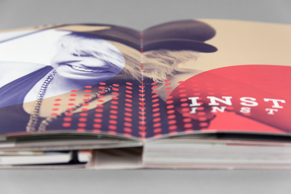
Using imagery interesting ways will allow for the double page spreads to be visually attractive and will encourage interaction with the publication.

reversing out pages with in the year book will also improve the over all visual outcome. Simplicity is often the best route to take when communicating a message with in a publication.


pushing the brand across other platforms will increase the familiarity . if we chose to consider the fine art yearbook a brand then success will be determined by the range of deliverables.


Print finish will determine the visual ecstatic of the final publication... using different finishes and effects will increase interaction with the publication which is the purpose of the brief. To promote the work of the fine art students.


Shapes and lines used along side images with and overlay is visually appealing and something that could be considered for the information based pages of the fine art publication.


Using variations in stock and colour will create an more interesting final outcome.. and can act as way of categorising the publication..
No comments:
Post a Comment