After the initial meeting myself and ben went away for a couple of hours and came up with some ideas on which direction to take the brief.. it became apparent that we needed to move away from a stereotypical photographers identity and work on the conceptual development of the brand whilst incorporating the idea of social coding.. I decided to revisit old pitches that weren't won and see how i could incorporate them into this brief.. the idea of coding or numbers.. was introduced when pitching for the graphic design yearbook as it was based on looking at the course as a rounded 360º idea.
The idea of an all encompassing identity works well with the idea of social coding due to the different perceptions of an individual which is dictated by society.. There for from this i decided to take the most basic part of the identity...Typefaces and reinterpret it..them using the idea of angles or codes that embody an all encompassing way of looking on things.. 360º.
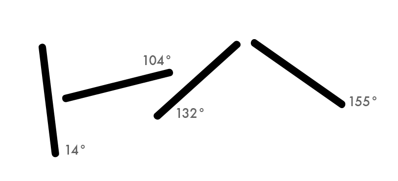
From this i started to break up typefaces.. on the angle.. starting at A-º to Z-360º
The final resolutions began looking as so.

The angles in which the letterforms were broken..
The broken letter forms.. you can begin to see how the identity will work.. it creates an interesting visual image.

We decided to only go to 180º for the visual quality.. as well as that with in the photography of bosh.. there is two sets of eyes.. the model and the camera or the photographer . therefore together they make a 360º angle of sight or perception.

How the logo could look.. i think the use of futura is a bit week.. due to the thin nature of the typeface.

The addition of the angles to the typeaface..pushes further the idea of coding.. further.. and makes a strong visual idenitty.

Beginning to look at taking away the lettter forms and just using lines as the brand identity..which would a give a more exclusive image that.. something that bosh himself wanted.
No comments:
Post a Comment